Glass Panel Clock & Currency UI - Part 2
My notes on building a practical clock/currency display using the glass panel from Part 1. Been working on turning that glass panel template into something actually useful – a clock-and-currency widget for the top-right corner. Figured I'd document the process since it covers some good UI-layout techniques that might help others (or future me when I forget how I did this).
Time Required: 20 – 30 minutes
Prerequisites:
- Completed Part 1: Glass Panel Tutorial
- Godot 4.x installed
- Basic familiarity with the Scene dock & Inspector
- A currency icon image (32×32 PNG recommended)
1. What You'll Build
A functional clock-and-currency widget:
- Reuses the glass panel template from Part 1
- Professional layout with time, date, and currency display
- Top-right corner positioning
- Ready for dynamic scripting (Part 3)

2. Project Setup & Scene Structure
2-1 Save the Glass Panel as a Reusable Template
First thing – turn that glass panel from Part 1 into something we can reuse everywhere.
- Open your glass-panel scene from Part 1
- Save it with a clear name: File → Save Scene As → "GlassPanel.tscn"
- Close the scene – we'll instance it in our new widget
Why this matters — This becomes our reusable template. Any improvements to the glass effect will automatically update everywhere we use it.
2-2 Create the Clock Widget Scene
Now for the actual widget scene.
- Create New Scene: File → New Scene
- Choose "UI Scene" – this gives us a Control root node (important for anchoring)
- Rename root to "ClockWidgetRoot"
- Save scene as "ClockCurrencyWidget.tscn"
Important: Using Control root instead of Node2D is crucial – Node2D doesn't provide proper bounds for UI anchoring, which makes positioning a nightmare.
2-3 Instance the Glass Panel Template
Instead of rebuilding the glass effect from scratch, we'll reuse our template.
- Right-click ClockWidgetRoot → Instance Child Scene
- Select "GlassPanel.tscn" from the file browser
- Important: Right-click the instanced GlassPanelTemplate → "Editable Children"
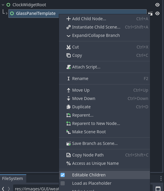
Don't use "Make Built-in" – that breaks the link to your template. "Editable Children" maintains the connection while letting you modify the instance.
Your scene structure should now look like:
└── GlassPanelTemplate (Control) [instanced]
├── BlurPanel (Panel)
├── GlassPanelPanel (Panel)
└── ContentContainer (Control) ← We'll work inside here
2-4 Resize for Clock Widget
The template is probably too big for a clock widget. Let's resize this instance.
- Select the instanced GlassPanelTemplate
- Layout → Anchors Preset: Should be "Custom" (if not, change it)
- Adjust Anchor Offsets for a smaller widget:
| Field | Value |
|---|---|
| Left | -250 (250 px wide) |
| Top | 20 (small margin from screen top) |
| Right | 0 (stays anchored to right edge) |
| Bottom | 120 (100 px tall total) |
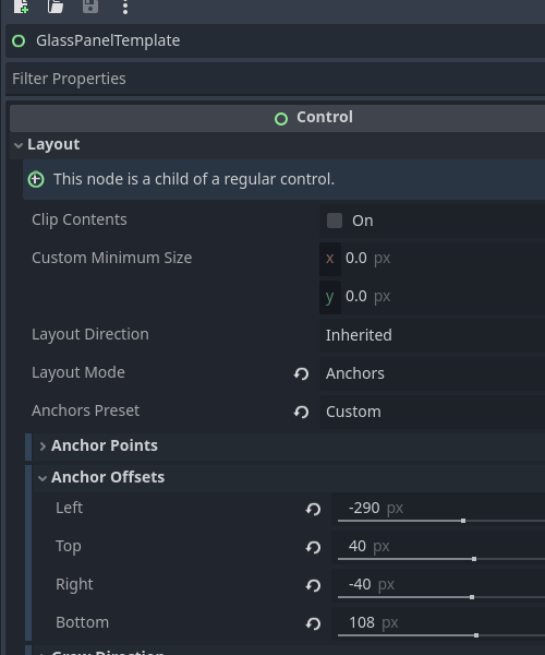
💡 Remember the offset math: Left=-250 + Right=0 = 250 px width, Top=20 + Bottom=120 = 100 px height
Test it: Press F5 to see your smaller widget-sized panel.
3. Building the Content Layout
3-1 Set Up the Main Layout Structure
Time to build inside the ContentContainer. Navigate to it in your instanced glass panel.
- Select ContentContainer:
- Add MarginContainer: Right-click → Add Child → MarginContainer
- Rename to "GlassPanelMargin"
- Layout → Anchors Preset: "Full Rect"
- Theme Overrides → Constants → Margins: Set all to 5 (creates clean spacing from glass edges)
- Add HBoxContainer: Right-click GlassPanelMargin → Add Child → HBoxContainer
- Rename to "MainLayout"
- Layout → Alignment: Center (makes content look more polished)
- Theme Overrides → Constants → Separation: 4 (space between clock and currency sections)
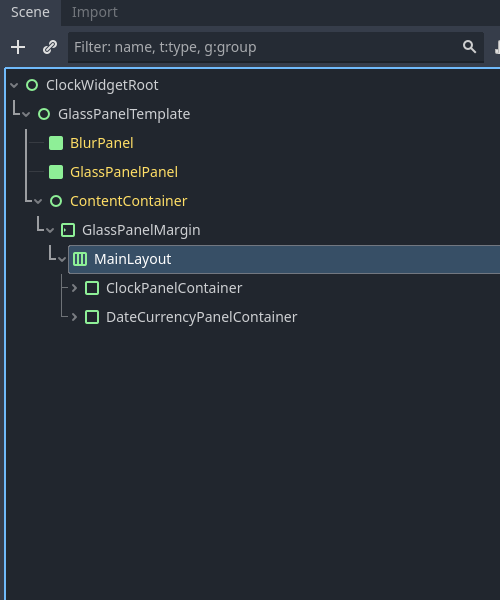
3-2 Add Section Containers
We'll use PanelContainer for each section – they handle both layout and can provide background styling.
- Right-click MainLayout:
- Add PanelContainer → rename to "ClockPanelContainer"
- Add PanelContainer → rename to "DateCurrencyPanel"
- Configure both PanelContainers:
- Layout → Container Sizing → Horizontal: Fill, check Expand
- Layout → Container Sizing → Vertical: Fill
Note: Container Sizing options are under Layout → Container Sizing, not in Theme Overrides.
3-3 Add Content Sections
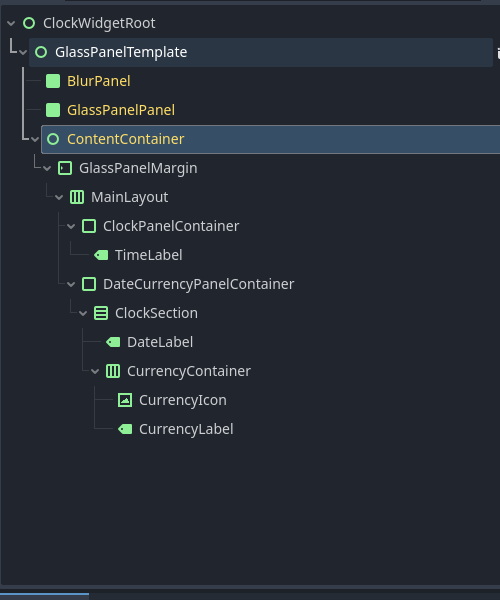
Now let's add the actual content nodes:
Inside ClockPanelContainer:
- Add Label → rename to "TimeLabel"
Inside DateCurrencyPanel:
- Add VBoxContainer → rename to "ClockSection"
- Add Label → rename to "DateLabel"
- Add HBoxContainer → rename to "CurrencyRow"
- Add TextureRect → rename to "CurrencyIcon"
- Add Label → rename to "CurrencyLabel"
Final structure:
└── GlassPanelMargin (MarginContainer)
└── MainLayout (HBoxContainer)
├── ClockPanelContainer (PanelContainer)
│ └── TimeLabel (Label)
└── DateCurrencyPanel (PanelContainer)
└── ClockSection (VBoxContainer)
├── DateLabel (Label)
└── CurrencyRow (HBoxContainer)
├── CurrencyIcon (TextureRect)
└── CurrencyLabel (Label)
3-4 Configure Content Layout
ClockPanelContainer:
- Layout → Container Sizing → Horizontal: Fill, check Expand
- Layout → Container Sizing → Vertical: Fill
TimeLabel:
- Layout → Container Sizing → Horizontal: Fill
- Layout → Container Sizing → Vertical: Fill, check Expand
- Horizontal Alignment: Center
- Vertical Alignment: Center
ClockSection:
- Layout → Container Sizing → Horizontal: Fill
- Layout → Container Sizing → Vertical: Fill
- Alignment: Center
DateLabel:
- Layout → Container Sizing → Horizontal: Fill
- Horizontal Alignment: Center
CurrencyRow (HBoxContainer):
- Layout → Container Sizing → Horizontal: Fill
- Alignment: Center
CurrencyIcon:
- Layout → Container Sizing → Horizontal: Fill
- Layout → Container Sizing → Vertical: Fill, check Expand
- Stretch Mode: "Keep Aspect Centered"
- Custom Minimum Size: x = 60, y = 50
- Expand: check this
CurrencyLabel:
- Layout → Container Sizing → Horizontal: Fill
- Layout → Container Sizing → Vertical: Fill, check Expand
- Horizontal Alignment: Center
- Vertical Alignment: Center
4. Adding Content & Styling
4-1 Add Placeholder Content
Let's add temporary content so we can see the layout while styling.
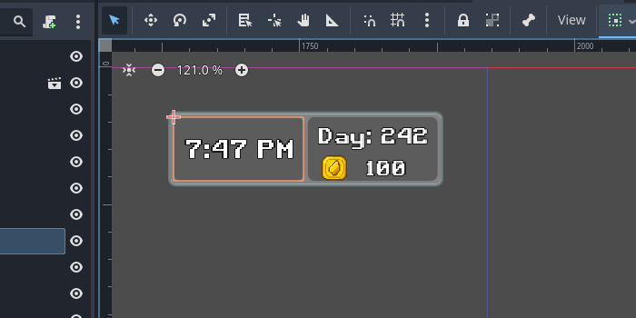
- TimeLabel: Text = "7:47 PM"
- DateLabel: Text = "Day: 242"
- CurrencyLabel: Text = "100"
- CurrencyIcon:
- Find a currency icon (coin, gold piece, etc. – 32×32 PNG works well)
- Drag the image file into your Godot project
- Texture: Drag the image from FileSystem to this property
4-2 Set Up Custom Fonts
Professional fonts make a huge difference.
- Get a font: download from Google Fonts (Roboto, Open Sans work well) or use any .ttf/.otf you have; drag it into the project
- Apply directly: select each label → Theme Overrides → Fonts → Font: drag the .ttf here
Font sizes I'm experimenting with:
- TimeLabel: 22 px
- DateLabel: 11 px
- CurrencyLabel: 14 px
4-3 Improve Text Readability
Text on glass backgrounds needs help to be readable.
For all labels, add outlines:
- Theme Overrides → Colors → Font Outline Color: Black (R = 0, G = 0, B = 0, A = 1)
- Theme Overrides → Constants → Outline Size: 3
Note: You need both color and size for an outline to appear.
Text colors: all White.
4-4 Style the Panel Backgrounds
I wanted subtle dark backgrounds to help differentiate each section:
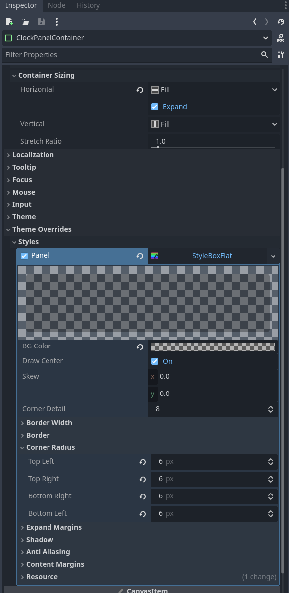
Both PanelContainers → Theme Overrides → Styles → Panel:
- New StyleBoxFlat
- Background Color: black, 30% alpha (R = 0, G = 0, B = 0, A ≈ 0.3)
- Corner Radius: 8 px on all corners
- Border settings: tweak as you like for separation
5. Final Layout Tweaks
5-1 Fine-tune Spacing
- MainLayout → Separation: 4 px
5-2 Test Everything
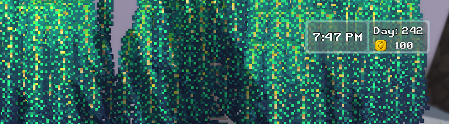
Press F5 and you should see:
- ✅ Professional-looking glass widget in top-right
- ✅ Large time display on the left
- ✅ Date and currency stacked on the right
- ✅ Currency icon properly sized next to amount
- ✅ Text that's easy to read with good contrast
- ✅ Clean spacing and proportions
- ✅ Layout that scales nicely
6. Advanced Layout Notes
6-1 Using Instancing vs Inheritance
Why we used instancing instead of inheritance:
- ✅ Reusable template: GlassPanel.tscn can be used for menus, dialogs, any UI overlay
- ✅ Focused scripts: clock widget gets its own script, separate from glass-panel logic
- ✅ Maintainable: improvements to glass effect automatically update all widgets
- ✅ Flexible: easy to create different widget types without code conflicts
When you instance a scene, you can:
- ✅ Resize and reposition that specific instance
- ✅ Modify colors, fonts, styling for that instance
- ✅ Add different content to each instance
- 🔗 Still get automatic updates when the template scene changes
6-2 Container Sizing Quick Reference
- Fill: takes available space in that direction
- Expand: grows beyond minimum size if parent has extra space
- Fill + Expand: takes space and grows with parent
- Shrink Center/End: aligns content when smaller than available space
6-3 Using MarginContainer for Clean Spacing
The MarginContainer (GlassPanelMargin) with 5 px margins creates clean spacing inside the glass-panel effect. This ensures your content doesn't touch the glass borders and maintains a professional look.
7. What's Next
You now have a beautiful static widget that looks professional and matches your game's aesthetic. The layout is solid and ready for dynamic content.
Coming next:
- Making the clock update in real time
- Displaying dynamic currency amounts from game state
- Managing currency-icon swaps for different currency types
- Formatting numbers with separators (1,000 vs 1000)
- Basic scripting to tie it all together
The visual foundation is complete – now we make it functional!
8. My Takeaways
8-1 What worked really well
- Instancing approach for reusability
- PanelContainer for section backgrounds
- Direct .ttf font application (no FontFile resources)
- Container sizing for responsive layout
- MarginContainer for clean internal spacing
8-2 Things that tripped me up
- Node2D root doesn't work for UI anchoring – always use Control
- Need "Editable Children" on instanced scenes to access internal nodes
- Outline needs both color and size to be visible
- Container Sizing is under Layout → Container Sizing, not in Theme Overrides
8-3 Techniques worth remembering
- Custom Minimum Size for precise control
- Negative separation values for tight text stacking (-7 px in ClockSection)
- Keep Aspect Centered for icons that need to scale
- Center alignment on containers for a polished look
- Transform Size on VBoxContainers for proportional control
Save this scene as a template – it's a solid foundation for any kind of game-UI widget!